First Maze, First Person
Daedalus Maze » Devlog


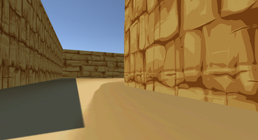
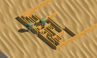
I created a bit of our first maze. I think there has to be more space between the walls (would love to read opinions on this).
Regarding the player, it is first person and for now it cannot move, just look around with the mouse (this functionality won't be available on our final game). The purpose of this prototype is just to build the maze, not the player, but I think it is important to be able to move through the maze to understand what has to be changed.
Please give me your opinion, @team :)
Get Daedalus Maze
Daedalus Maze
More posts
- MOJO Updates and Final ReportJul 01, 2022
- After MOJO refactoringJul 01, 2022
- Updates after MOJOJul 01, 2022
- UpdatesJun 30, 2022
- Sound EffectsJun 25, 2022
- Final main, pause and options menus with all features workingJun 24, 2022
- Game SoundtrackJun 23, 2022
- Daedalus' Diary for 2 PlayersJun 23, 2022
- Reset puzzle and cheat keysJun 17, 2022
- Section 3 moving wallsJun 17, 2022
Comments
Log in with itch.io to leave a comment.
Very cool ! Completely agree, I just think. the camera is a bit too close to the ground right now.
I agree that it is looking down too much. However, I think it is close enough to the ground because this way we make the maze look bigger and more majestic
I love it! I agree with the space in the left image, i think it is a great compromise between playability and a feeling of claustrophobia.
Nice :D